Open concept homes offer a sense of airiness, movement, and modern elegance. But with that openness comes a unique challenge: how do you choose interior paint colors that work seamlessly from one space to the next? Whether you’re blending a living room into a kitchen or a dining area into a hallway, harmony is everything. The goal is to create visual cohesion without making your space feel monotonous.
Let’s explore the top interior paint color combinations that help you maintain flow while giving each zone its own subtle personality.
Understanding Color Flow in Open Spaces
Before we dive into interior painting color combinations, it’s important to understand what makes interior paint colors clash in open layouts. It usually comes down to undertones and saturation. If one room features a warm beige and the next has a stark, cool gray, the transition feels abrupt. In contrast, when colors share similar undertones—warm with warm, cool with cool—they create a natural flow, even if they’re different hues.
In open concept homes, this flow is vital. Unlike traditional layouts, where walls separate each space, open plans rely on interior paint colors to subtly define and connect zones. With the right palette, your home can feel both unified and dynamic.
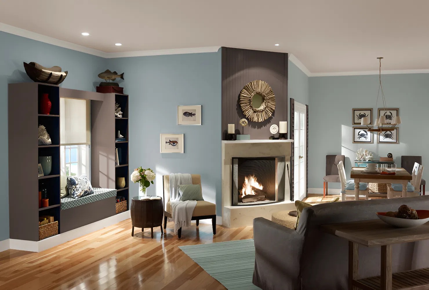
Soft Neutrals: The Foundation of Cohesion
One of the most effective ways to avoid clashing is by building your palette around soft, adaptable neutrals. These hues serve as your base—think of them as your canvas. A warm greige (a blend of gray and beige) works beautifully in a living room and transitions effortlessly into creamier tones for dining or kitchen spaces.
Because these shades are understated, they allow for layered decor and bolder accents. You can even pair different neutrals with each other, as long as they maintain a similar warmth or coolness. When used correctly, these interior paint colors create a continuous backdrop that doesn’t fight for attention but enhances everything else in the room.
Accent Shades That Subtly Stand Out
Just because you’re working with open spaces doesn’t mean you have to avoid contrast. In fact, a well-placed accent can add depth and interest. The key is choosing interior paint colors that complement your base rather than compete with it.
For example, if your living area features a soft taupe, consider a sage green or dusty blue accent wall in the dining zone. These tones offer a gentle contrast without creating a visual jolt. The magic lies in muted undertones and careful placement—ideally near furniture groupings or architectural features that help define space.
Tone-on-Tone Combinations for Sophisticated Transitions
Tone-on-tone is a foolproof method for painting open spaces. It involves choosing interior paint colors from the same color family but varying their intensity. For instance, a pale sky blue in the kitchen can flow into a deeper slate blue in the adjacent living area. This approach adds depth and distinction without disrupting the overall flow of the home.
These variations are especially effective in large open plans where too much sameness can become flat. The gentle shifts in tone provide subtle visual breaks while preserving a cohesive aesthetic.
Warm and Cool Pairings
While mixing warm and cool interior paint colors can be striking, it requires finesse. If you’re set on pairing a warm beige with a cool blue, bridge the two with a transitional color—perhaps a soft green-gray that echoes elements of both. Without this buffer, the change can feel disjointed and make your space appear fragmented.
A good rule of thumb is to limit high-contrast pairings to accent walls or secondary spaces like entryways or breakfast nooks. These areas naturally feel separate, even in an open layout, making them ideal for experimenting with bolder choices.
Interior Paint Colors That Work Across Lighting Conditions
Natural light plays a huge role in how interior paint colors are perceived. A color that looks warm and cozy in a sun-drenched dining room may feel dull in a shadowed hallway. When selecting your palette, consider how light shifts throughout the day. Test your chosen interior paint colors in different corners of your space before committing.
Opt for shades that have proven to perform well in various lighting—soft grays with warm undertones, pale blushes, muted olives, and creamy whites are all safe bets for open layouts with mixed lighting conditions.
Choosing the right interior paint color combinations for open concept spaces isn’t just about picking trendy hues. It’s about understanding how color behaves in large, uninterrupted environments and using that knowledge to craft a home that feels balanced, intentional, and inviting.
Choose Total Pro Painters for Expert Residential Painting Services in Wellesley, MA
Ready to bring harmony to your open concept home? At Total Pro Painters, we specialize in transforming residential interiors with expertly selected interior paint colors that elevate your space. Whether you’re tackling a full repaint or refining your palette, our experienced team is here to help.
Contact us today for a consultation, and let’s create a home that flows beautifully.